In a world full of vibrant hues and infinite possibilities, choosing the perfect color combination can be an agonizing task. Whether it’s for your home decor, wardrobe, or even branding your business, the right mix of colors can create a powerful impact. But with countless options at our fingertips, how do we narrow down the choices? Fear not! In this article, we’ll delve into the realm of color psychology and explore two extraordinary color combinations that are guaranteed to captivate your senses and leave you feeling inspired.
The Impact Of Warm And Cool Colors
The impact of warm and cool colors extends far beyond just aesthetics. Warm colors, such as shades of red, orange, and yellow, evoke feelings of energy, passion, and warmth. They can create a sense of liveliness and excitement in a room or design. In contrast, cool colors like blue, green, and purple have a calming effect and can promote feelings of relaxation and tranquility.
When it comes to choosing the best color combination for any space or design project, understanding the psychology behind warm and cool tones is crucial. For instance, combining warm colors with cool ones can create a balanced visual experience that stimulates both energy and calmness at the same time. This dynamic juxtaposition can be particularly effective in spaces meant for productivity or focus.
Color combinations consisting solely of warm or cool tones also have their own unique impacts. A predominantly warm color scheme can make a space feel cozy and intimate while reflecting vibrancy; perfect for creating an inviting atmosphere in living areas. On the other hand, a primarily cool-toned palette will give off a soothing aura that works well in bedrooms or spaces intended to inspire restfulness.
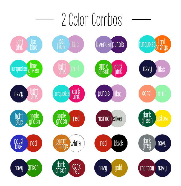
Harmonious Color Combinations:
Color is a powerful tool that can evoke emotions, set moods, and create visual interest. When it comes to harmonious color combinations, two popular options are complementary and analogous colors. Complementary colors are opposites on the color wheel, such as blue and orange or red and green. This pairing creates a strong contrast that instantly grabs attention and adds vibrancy to any design.
On the other hand, analogous colors are neighbors on the color wheel, like yellow and orange or blue-green and green. These combinations offer a more subtle harmony by sharing similar undertones. Analogous color schemes tend to create soothing effects and provide a sense of unity in design.
While complementary colors make designs pop with their high contrast, they can also be challenging to balance successfully without overwhelming the senses. In contrast, analogous colors offer a more seamless blend that feels cohesive but may lack visual impact if not properly leveraged.
Contrasting Color Combinations:
Contrasting color combinations can make a design pop and evoke different emotions. Two popular contrasting color schemes are triadic and split-complementary. Triadic colors are three equally spaced hues on the color wheel, creating a vibrant and harmonious look. They provide a balance between warm and cool tones, offering an energetic yet cohesive feel to any design. On the other hand, split-complementary colors consist of one base hue and two hues adjacent to its complementary color. This scheme provides a blend of contrasting colors that allows for more flexibility while still achieving visual impact.
- Triadic color combinations offer designers an array of options when it comes to creating visually appealing designs. With three distinct colors equally spaced on the color wheel, there is plenty of room for experimentation and creativity. The harmonious nature of triadic colors helps maintain balance in compositions while adding vibrancy and interest through the use of contrasting hues.
- In contrast, split-complementary color combinations offer a more subtle approach to contrast by using one dominant hue with two supporting colors from either side of its complementary shade. This scheme creates a sense of harmony while introducing enough variation to keep the design visually compelling.
Both triadic and split-complementary color combinations have their unique benefits depending on the desired aesthetic outcome. While triadic provides boldness with harmonious blends, split complements offer a sophisticated twist with muted contrasts but still maintaining an overall sense of balance.
The Psychology Behind Different Color Combinations
Color is a powerful visual language that can evoke different emotions and moods. The psychology behind different color combinations plays a crucial role in how we perceive and respond to the world around us. When it comes to choosing the best 2 color combination, it’s important to consider their psychological impact.
Contrasting color combinations, like red and green or blue and orange, create a strong sense of vibrancy and energy. These combinations tend to grab our attention and often symbolize excitement or dynamism. On the other hand, analogous color combinations, such as yellow and orange or blue and purple, create a sense of harmony and unity. These combinations are soothing to the eye, making them ideal for creating relaxing environments.
Ultimately, the best 2 color combination will depend on the desired effect you want to achieve. Whether it’s capturing attention or creating a calm atmosphere, understanding the psychological impact of colors can help you make informed choices that resonate with your audience or enhance your personal space. So next time you’re choosing colors for your bedroom walls or designing a new logo for your brand, consider delving into the psychology behind them – it might just guide you toward perfect pairings that truly speak to people’s emotions.
Conclusion:
In conclusion, finding the best color combination for your needs is not a one-size-fits-all approach. It requires careful consideration of various factors such as the purpose, audience, and emotions you want to evoke. While some color combinations may be widely popular and aesthetically appealing, they may not necessarily align with your brand or resonate with your target audience.
It is important to understand that colors have psychological associations and can elicit different emotions in people. For instance, blue is often associated with calmness and trust, while red evokes excitement and passion. By taking these associations into account along with your specific requirements, you can create a color combination that makes a lasting impact on your audience.
Furthermore, it’s essential to test different color combinations before finalizing your choice. Conducting user research or collecting feedback from others can provide valuable insights into how people perceive the colors you have chosen. Remember that the goal is not just to find visually pleasing colors but also to convey the desired message effectively.
Ultimately, there is no definitive answer about which two-color combination is best since it largely depends on personal preference and context. Experimentation and considering unique aspects of your brand will help guide you toward discovering an impactful color combination that enhances your message and resonates with your target audience.


Be First to Comment